Tuesday, September 25, 2012

Wait for it....


When you have awesome clients....


....fabulous materials...(what's not to love about 36" x 24" slate wall covering, granite, rich wood cabinetry...I mean seriously???)


....wonderful installers....


Just wait til you see it finished!!!!!!!

Wednesday, September 5, 2012

Urban Mountain Retreat


This gorgeous Manhattan home's design was inspired by the surroundings of a mountain retreat...only nestled in the Flint Hills rather than Breckenridge!


For those who don't understand how a modern look can meld beautifully with traditional features, take a look at this....


Stainless steel, glass tile and a fabulous range hood work perfectly with the dark stain on the cabinetry and the rough texture of the stone work.


By bringing the warmth of the brown tones together with the cool greys, we again merged the traditional elements with the sophistication of the more modern finishes.


The large mudroom, "drop" zone, complete with cubbies and killer charcoal color tile will carry you from the garage to the kitchen in pure functional style!!


In the large family room, the eye-catching views draw you out from the cozy fireplace to the covered deck...the dramatic railing speaks to the urban modern mountain retreat that inspired the space.


This gorgeous freestanding tub and floor mounted faucet, bring the relaxation factor up a couple of notches!!  Who wouldn't want to come home to this???


(Want to see how we took this spec home from concept to finish??  Read here!!)

[post_comments]


Wednesday, August 29, 2012

Casual English Manor


It's not every day that we start from scratch on a home, but in this client's situation, they had recently moved into a new home...and due to busy schedules and a lack of design direction, this house had yet to be turned into a home!  Now this family is a dynamic group...full of energy, loads of hobbies and interests...and they desired their home to reflect who they are...after our first meeting, we knew exactly what direction we wanted to go to transform this home from empty and echo-y, to warm and inviting...
"Before"


We took the family's love for all things outdoors and blended it with their overall classic aesthetic to create a "casual english manor"...


Our first order of business was to strengthen the focal point of the room, the fireplace.  We also needed to work out a furniture plan that was both functional and welcoming and took advantage of an irregular space.  Then the crowning touch was the addition of the ceiling beams to add warmth, architectual interest and a little wow!!


We were able to include seating for 6-8 without crowding the space!  The woven shades in the windows repeat the darker wood tones of the rich beams, which pull out the chocolate undertones in the lighter oak flooring.  The "beam" mantel was created by our contractor.


In the eat-in kitchen, an updated light fixture, new table, window shades, a few personal pieces and a smartly-tailored valance pull the space from lonely to welcoming!


Around the corner in the new dining room, the stage has been set for grand dinner parties, or cozy family gatherings...


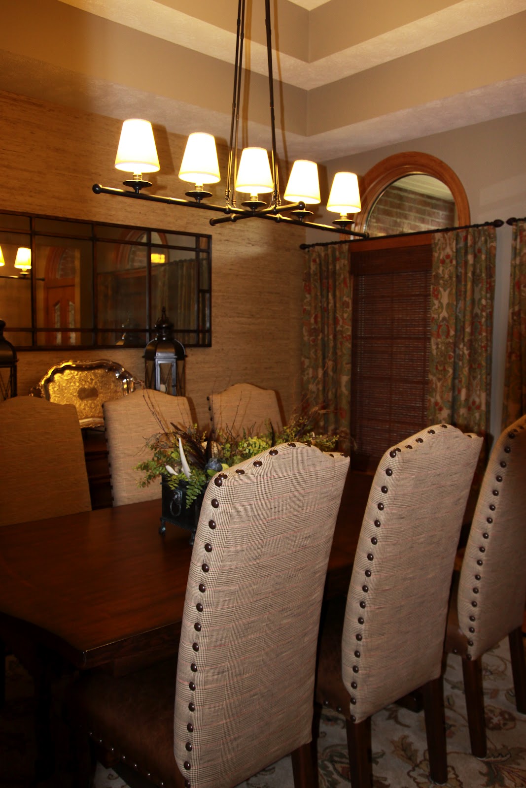
According to these clients, AsterHouse "nailed it"...their home perfectly reflects

them and the way they live and function there...what greater compliment could you ask for??!!!

Thanks to all of our clients for the amazing priviledge of working in your most precious, sacred, private spaces...your homes!!


[post_comments]

Thursday, August 9, 2012

A spec sneak...


This summer has been a whirlwind of activity around here!!  We have had multiple large projects in production…which simply means a lot of details to keep up with and lots of car time…driving from project to project to check in on progress, double check stain colors and answer questions from contractors!!  It is a little similar to a pregnancy…waiting, anticipating, preparing, waiting, wondering, excited, and finally, with little say on the timing...(haha...the nature of constructions!!) the thrilling reveal!!!


Not unlike a pregnancy, there is a lot happening before any noticeable changes take place…take our current spec home, for instance…the contractor hired us to bring a fresh look to his project…our challenge was to bring some updated finishes to a home that needed to appeal to the majority of buyers, since this was not a custom build.


So we started here…way back at the beginning...


Original floorplan


with a floorplan…reviewing the layout, the traffic flow, the storage options…we tweaked it…(no mudroom?? must have!!)…and then we moved on to visualizing and presenting a design concept…


"...inspired by a modern mountain retreat. A comfortable mix of traditional designs with contemporary clean lines and updated finishes, along with a fresh color palette that is inviting and compatible with any design style, truly sets this home apart." -listing details per AHD


...and then added the details that would take our inspiration and make it the home of someone's dreams!!!!


And here is a sneak at the spec house progress….


We are thrilled with the outcome!!  It looks awesome!!!

And the builder is pleased to say this one is now sold!!

Final pictures to come!!

[post_comments]

Sunday, July 15, 2012

What a picture is worth...

I love wall art hung in a gallery style arrangement!!  It is a fabulous way to combine the pieces that make people happy into a display that reflects those who live/work in the space!! 

Sometimes these walls are symmetrical, neat, tidy and soothing because of the similarity of content and the layout of the pieces in an even grid-like pattern.


Houzz.com

Other wall galleries are a selection of various pieces, but create the same symmetrical quality thanks to matching frames that pull the look together.


Houzz.com

  In other settings, the display is set apart by the rich colors but the cohesion of the subject and framing keep the look very tailored.


Tobi Fairly

  For those who prefer a more eclectic aesthetic, the trick to pulling it all together is in the arrangement. The obvious forthought that went into this gallery wall, make it a purposeful arrangement and not just a "hodgepodge" collection!


Houzz.com

We have all seen the wall gallery that was just a bit too eclectic...and sometimes we wonder what makes the difference??  How do you take a seemingly disimilar group of objects and create a vignette that makes you smile??  It is all in the planning, layout and execution...


AsterHouse Design

Whether you are going for a symmetrical look...or you want the thrown together eclectic style, you will need to plan it well for it to be successful!!  (And yes, this will require a tape measure and quite possibly a level!!)

Check out this adorable video tutorial put together by my fabulous sister-in-law, Ashleigh Graber with Design Aglow...then get out your hammer and nails and make your walls talk!!!!


[post_comments]

Friday, June 29, 2012

Let's go shopping....

Let’s just pretend, for kicks, that we lived in Centennial, Colorado…or maybe West Chester, Ohio…or suppose we moved down to Sunrise, Florida…if any of these were the case, then you would not be about to enjoy this blog post!!  But we do not live in Bloomington, Minnesota or Bolingbrook, Illinois…and so, we have to rely on friends!!  Friends who are true friends will go the extra mile, they will drive to the store they have never even been to, they will be overwhelmed by the massive hugeness of the task of finding the precious needed treasures on your list…and they will conquer…all because you do not live in Frisco, Texas…


Amanda and I love to high/low…this means mixing higher quality, and thus higher priced, items with off-the-shelf bargains from Target, IKEA…you name it!  Even our most discriminating clients appreciate that we can hunt down a bargain…even the largest budget hits a ceiling somewhere!!  And so it was with our own offices….and since we were not willing to sacrifice form for a functioning space….we brought in the cavalry!!


They scoured the aisles, filled up a cart, searched through the names no one outside of Norway...or is is Sweden can pronounce...a "KLIPPAN" what???  "EKENÄS" who??


Our loyal friend (and her lovely daughter) took on IKEA for us because we were desperate for some great pieces (read: cheap price but good quality…modern look but not modern price…fun and a little funky, but not expensive…is there a theme here???) for our recent office reno!!  (See the almost finished product here


Thanks again ladies!!  We appreciate it from the bottom of our "HOVÅS"...oops...getting a little carried away...

[post_comments]

Sunday, June 17, 2012

Form or Function?? Yes!!

Over the last few months, Amanda and I have been slowly but surely pulling our own design space together.  We approached our office in the same way we do any client's space…we have just been implementing our plan VERY. SLOWLY. 

Honestly, we didn’t actually set out to “do” the AsterHouse office…we had literally dumped all of our paraphenalia into the raw space and thought we would tackle it when we had the time and budget to do it "right"!!  But because we both operate best when we are inspired by our environment,  it didn't take long to see the need to get the office done…or least started...

As much as we desired the space to provide the inspiration for great design ideas…we knew it would never be right unless it functioned well…and that, we knew, was the first place to start.  AsterHouse loves to create gorgeous spaces, but if that space does not function well it is a huge FAIL in our minds…so, that is where we always begin…whether for a client or our own office!

For our home away from home, the wish list was kinda long…we have a nice size space…about 20’x18’, but it needed to house two desks, an "island-ish" place to lay out projects or splay our huge drawings.  We needed a “lounge area” to host clients as well as attractive storage space to hold our growing collection of fabric samples, vendor catalogs and our office stash of Twizzlers!!  (Must have creative fuel!!) 
When thinking through the function, elements of form always enter the mind and often inform the layout…for instance, we like to work facing each other…it makes bouncing ideas off so much more fun when you can see each other face to face…so, instead of two separate desks we found this fabulous “dining table” at West Elm...


...and it was our jumping off point for the whole work station!  We sent a friend on a wild goose chase through IKEA (a whole other post!!) to pick up some fabulous storage pieces for the walls and we had a local contractor build us a custom wall unit!!  (the top will eventually be covered in stainless!!) 

With the white laquered furniture, storage pieces and white trim, we chose a pale gray for the walls...I will admit that it took two tries to get it right...but we love it!!  Perfect backdrop to all the gorgeous colors that roll around our creative space!!


SW7671 On The Rocks


So here is what we have so far!!  I don't really have any good "before's" and it is not even close to complete so it cannot be referred to as an "after"...so here is a "now"!!


(I will save the lounge area for another post....the furniture is in place but everything is still in "before" condition!!)

[post_comments]